
Gartner Digital Markets isn't just a business unit within Gartner, Inc. – it's a passionate team on a mission. Our goal was to personally empower organizations to supercharge growth by guiding them toward the perfect technology and services. Think of the brands as more than just a marketplace; Capterra, GetApp, and Software Advice are your dedicated partners, forming an intimate network that's your go-to global source for discovering and evaluating software and services.
Parallel to the evolution of our other buyer brands, the formulation of GetApp's visual identity was a meticulously orchestrated and strategic initiative underscored by research gathered directly from our users. With a deliberate focus on achieving a modern and tech-savvy ambiance, we conscientiously adopted a cooler tonal palette. Additionally, an isometric perspective was systematically threaded throughout the entirety of the visual identity to enhance its coherence and reinforce the brand's visual cohesion.
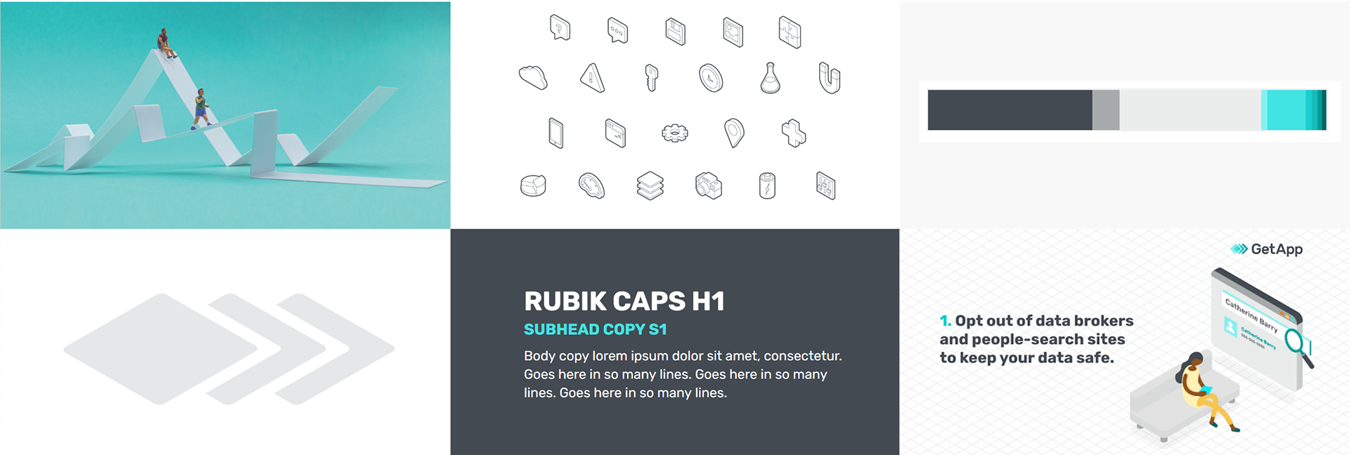
Just like with the other buyer brands, we started by identifying the fixed elements we had to work around—things like the existing color palette, which needed to stand apart from our sibling brands, and the logo, developed in partnership with an agency. From there, we focused on building a system that could flex across a huge range of categories while still feeling cohesive and on-brand.

Animation I created to help communicate how the isometric graphic expression would work across illustration and layout.
Content Systems
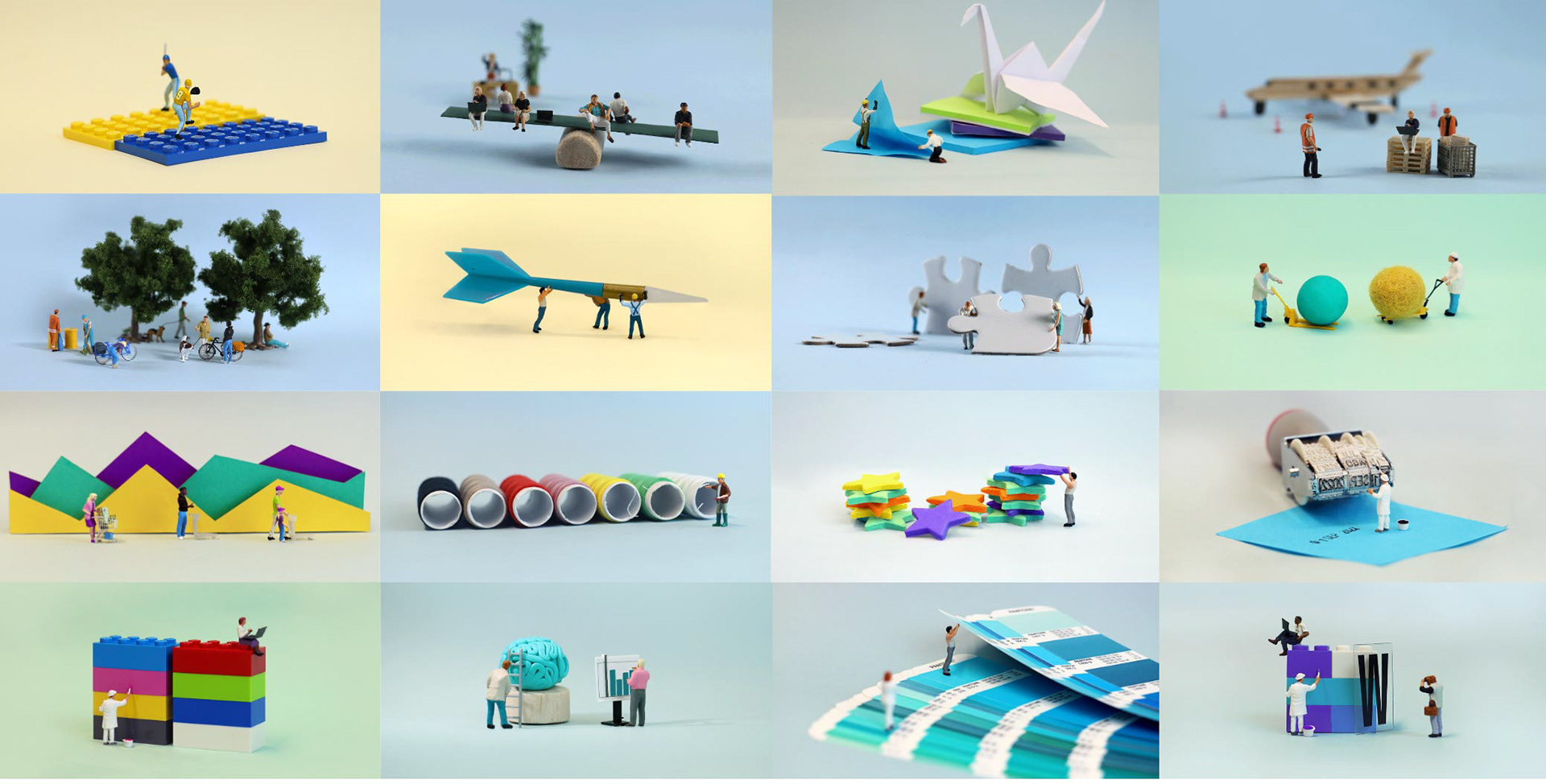

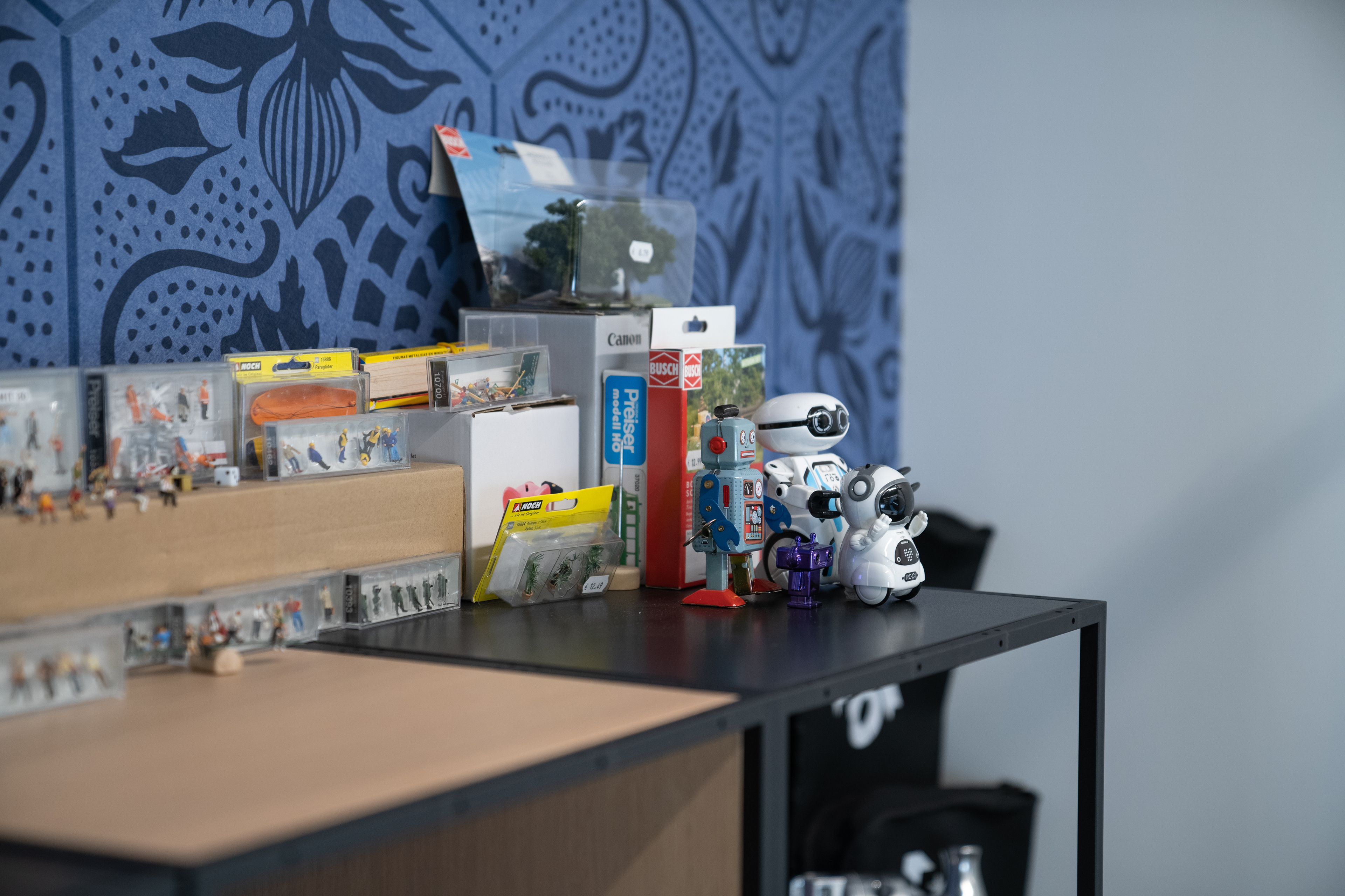
Miniature Composition Photo Studio
Itemized Components Sorted by Category
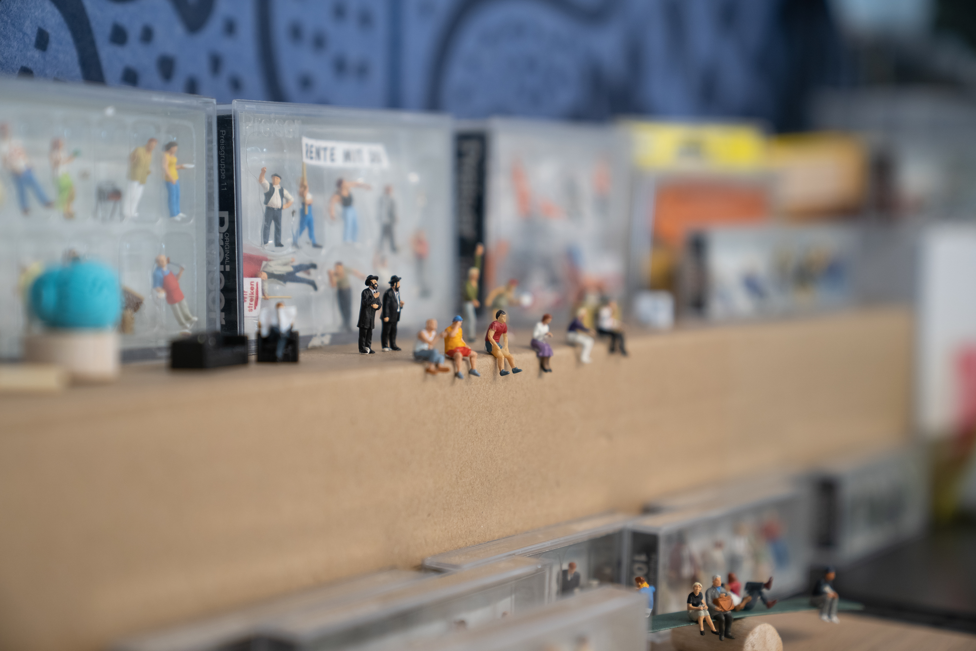
Diverse Range of People Figures
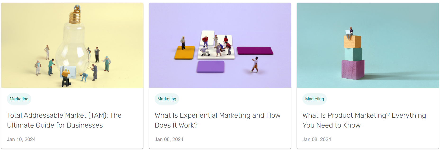
The Miniature Header Design System was born out of a need to strengthen GetApp’s content marketing presence. Built around simplicity, the system used everyday objects and a wide variety of miniature figures to tell visual stories centered on technology and innovation. The isometric perspective—already a key part of our visual language—carried through seamlessly in these scenes, helping maintain cohesion across the brand.
Over time, what began as a practical design solution grew into a rich, creative library. The miniatures became a storytelling tool, allowing us to craft more complex, nuanced narratives. It evolved into a signature visual style—one that set GetApp apart and deepened our connection with audiences through thoughtful, unexpected details.
Illustration Systems
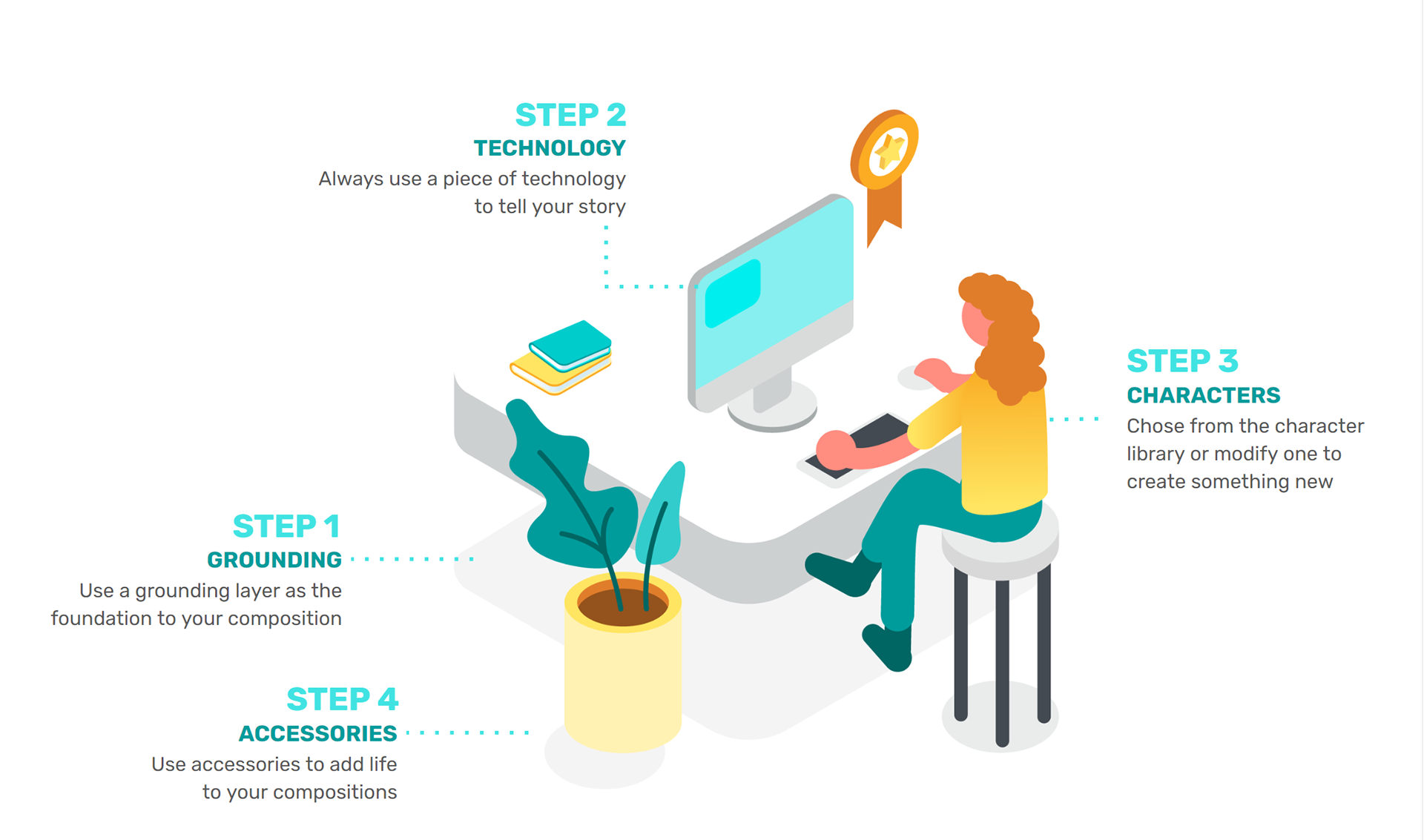
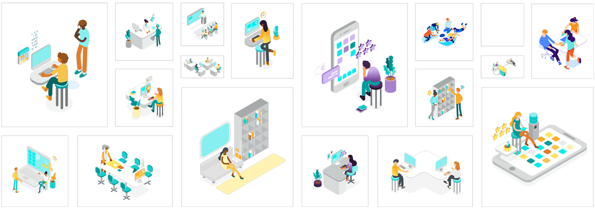
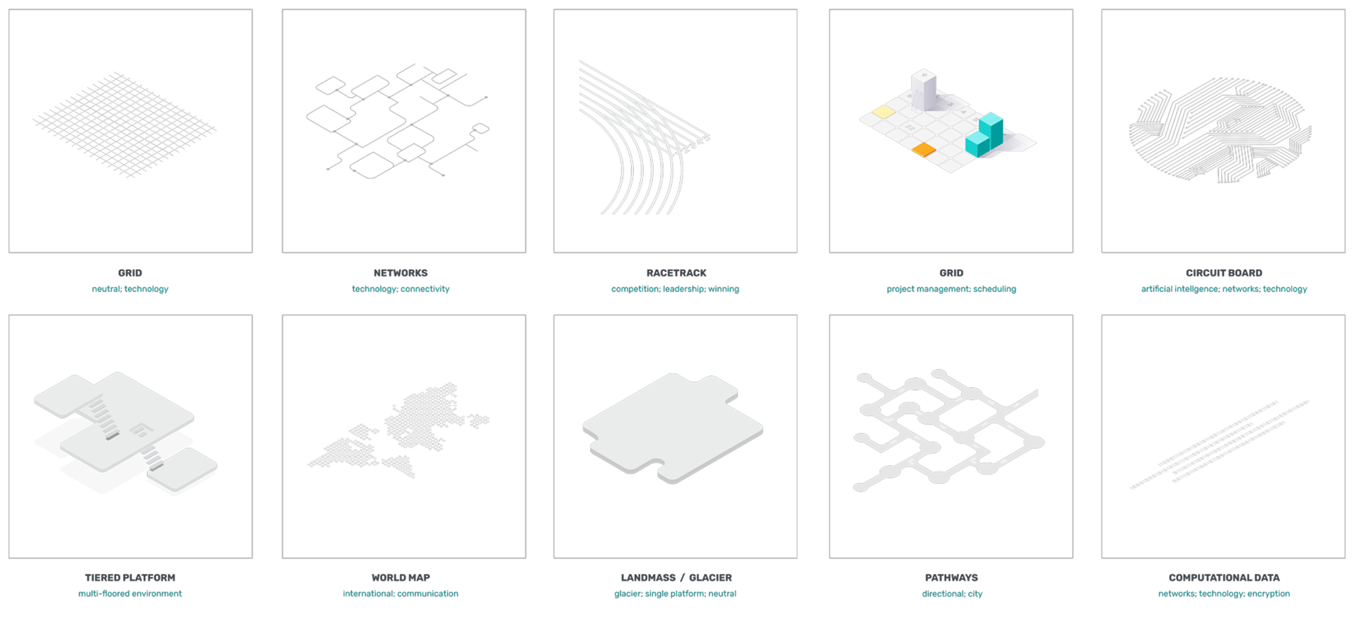
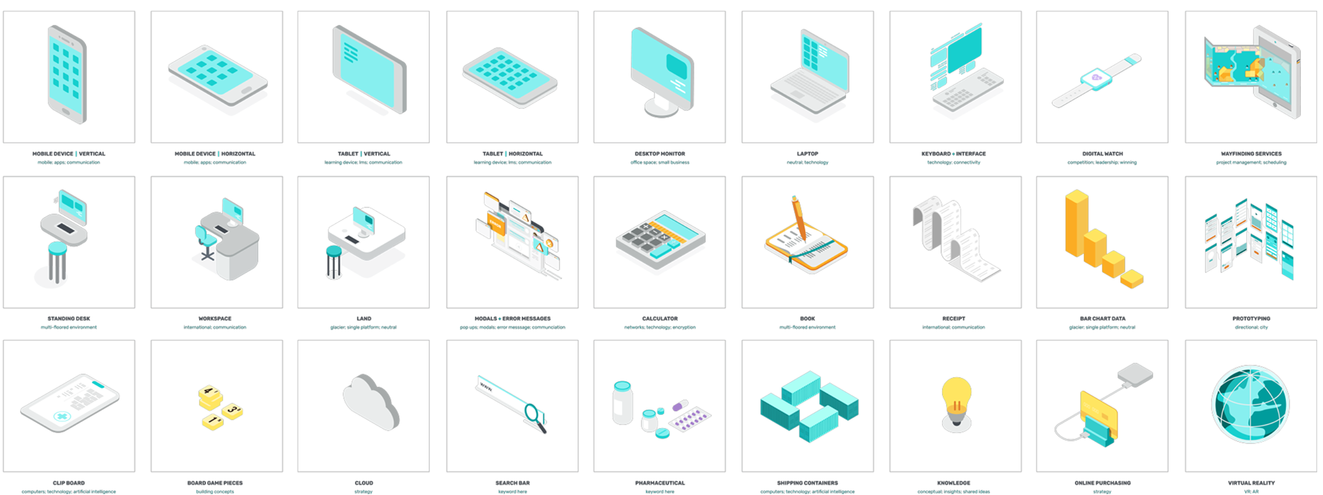
Within GetApp’s content space, the Miniature Header System served as the primary visual language. But as we expanded into new formats—like infographics and eBooks—it became clear we needed a more flexible illustration system. It had to be adaptable enough to cover a wide range of topics while staying modular and easy for the whole team to use.
To solve this, we developed a set of composition guidelines and built a library of reusable components. With these elements in place, designers could assemble visuals much like building with Legos—quickly, consistently, and without starting from scratch each time. This approach streamlined production and made it easier to create clear, compelling visuals across any subject matter.
Video
Video Production: David Bukstein; Art Direction: Garvin G. Grullon