
Gartner Digital Markets isn’t just a business unit within Gartner, Inc.—it’s a team with a mission: to help organizations grow by connecting them with the right technology and services. Capterra, GetApp, and Software Advice aren’t just marketplaces—they’re trusted partners in a global network that supports users through every step of their software discovery journey.
For Software Advice, developing its visual identity was a thoughtful, research-driven process. We dug into market analysis to better understand what set this audience apart—what they valued, how they wanted to feel. With those insights in hand, we crafted a visual language that not only reflected the brand’s core values but also emphasized what mattered most to its users: the ability to connect with a real person on the other side.
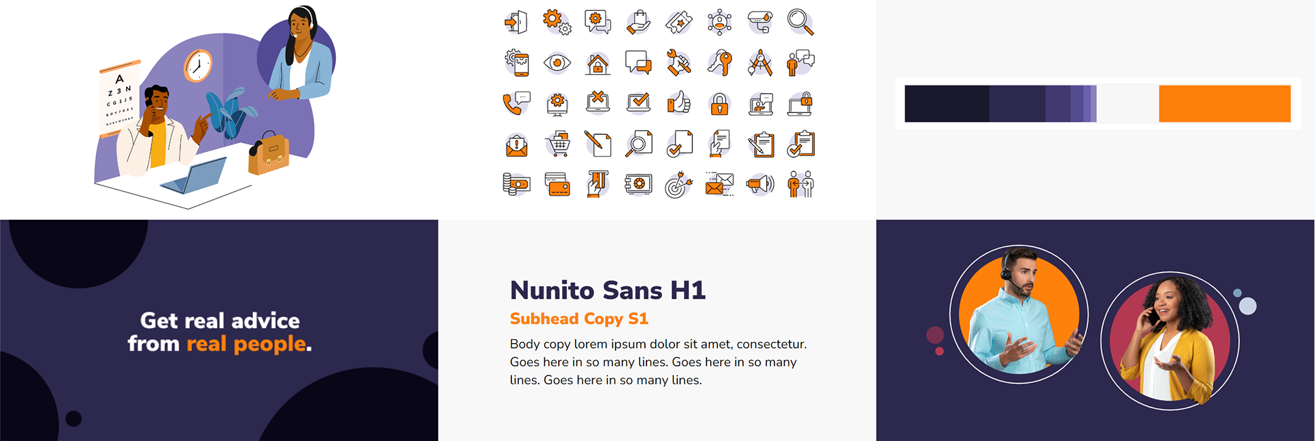
To help Software Advice stand out in a competitive landscape, we leaned into a warmer color palette that conveyed approachability and friendliness. Our illustration and photography systems followed suit, favoring more organic shapes and textures to create a softer, more human feel. The result was a visual identity that set the brand apart from its siblings—one that felt warm, trustworthy, and genuinely helpful.
Illustration System
At the core of our illustration system was a single guiding principle: modularity. To support the fast-paced needs of our content team, we designed a system that allowed anyone—regardless of illustration experience—to easily build narrative-driven visuals on demand. Beyond its technical flexibility, the system also needed to deliver visual versatility, capable of representing a wide range of topics across more than 950 (and counting) software categories. All while standing out in the market and feeling right at home within the Software Advice brand.

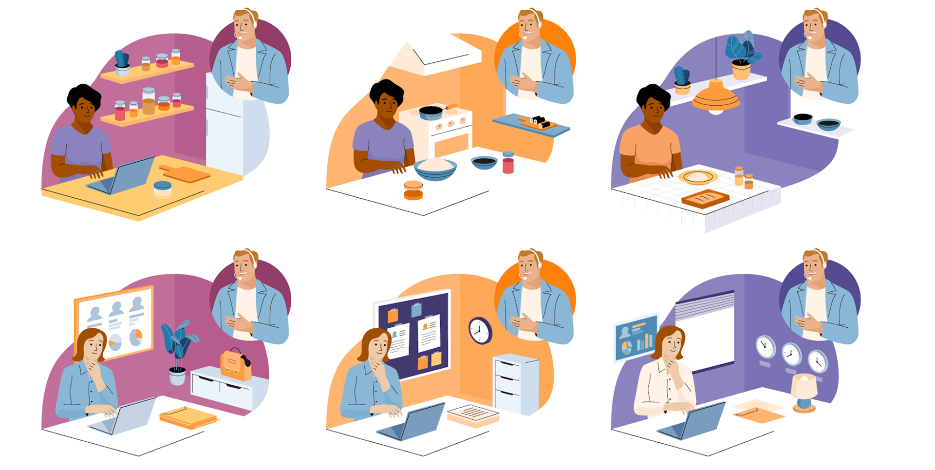
Modular backgrounds made telling stories across categories easy.

Compositions were designed to tell stories that showed how an advisor could help, but was modular enough to function without this treatment as well.
The foundation of the Software Advice illustration system was built through close collaboration—starting with early concepting alongside Cami Dobrin and moving into development with Gustavo Bouyrie. Once we cracked the compositional formula that could flex across a wide range of subject matter, we began growing the library of elements: people, lamps, plants—everything needed to build out scenes with modular storytelling potential. Each composition was designed so individual parts could be swapped to tell entirely new stories with ease.
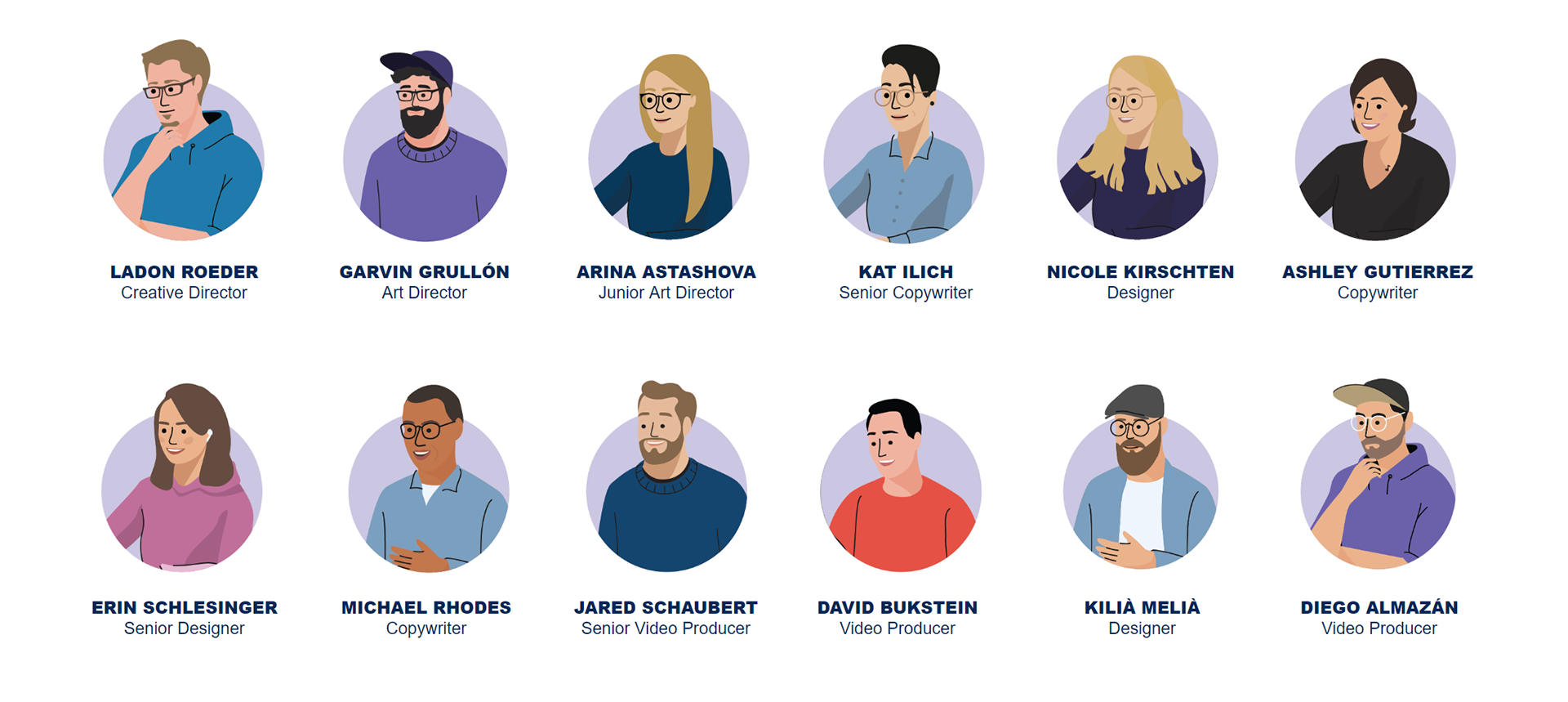
As our creative team grew, the addition of Arina Astashova brought fresh perspective and energy, pushing the system even further. That collaborative momentum became the heartbeat of the project, resulting in a dynamic visual language that didn’t just meet our content needs—it captured the spirit of a brand people felt drawn to and enjoyed engaging with.
Commercial
Creative Direction: Ladon Roeder; Art Direction: Garvin G. Grullón
YouTube Ad featuring the illustration and animation style of the brand.